Sunday, July 09, 2006

Oh, Frank, How You Make Us Laugh!

The last paragraph of the NY Times article on the planned Abu Dhabi Gugg, to be designed by Frank Gehry:

"While Mr. Gehry said it was far too early to describe a possible design, he predicted that it would not
resemble his sinuous stone, glass and titanium Bilbao. 'I don't think I repeat myself,' he said."

AH HAHAHAHAHAHAHAHAHA!!!

Friday, June 16, 2006

Art Basel: Expensive Shit

So, Art Basel is entering its end run now. Most of the primo stuff at these fairs is snagged before must people even see it-- collectors sneak in ahead of time, or they buy stuff their dealers send them cellphone pix of, and by the time the masses arrive on the weekend, there are red dots next to all the works (unless the galleries move out the sold goods and do a second hanging). But, you know, I'm not an expert, so if you want to really read about who bought what and all that art-world gossip, you should read the Art Newspaper (which has a daily edition for the duration of the fair) or Artnet or Artforum.

The Art Newspaper had an article on "Bling Conceptualism," because lots of artists seem to be working in expensive materials these days. I don't know, I don't really remember the article now and there's no link to it on the website. But it mentioned Terence Koh's work, part of Art Statements, presented by Peres Projects, which contains gold "turds":
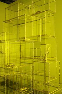

It sold, of course, right away. And this reminded me of something I read a while back in that online magazine Artkrush about some designer kid, Tobias Wong, who makes capsules of gold flakes that you eat to turn your shit into gold.
I mentioned this to my good friend, Grumpy Old Man.

OAC: This designer makes gold capsules that you eat and they make your shit gold.
GOM: Your shit turns into gold?
GOM: you mean, like, gold flakes?
OAC: Well, yeah, obviously you can't then turn your shit into a necklace. It makes it look gold.
GOM: no way it makes your shit gold. I'm sorry. that's just stupid. I'm going to
"design" my own product called "gonorrhea" that makes you pee red.

Speaking of turning shit into art, a reader of my column over on the Suicide Girls website brought my attention to a story about recent events at the Royal Academy of Arts in London. Now, I'm not an expert, but I think this is a morality tale for our times-- really an object lesson in the confusion that is a result of what's going on in art these days: The Royal Academy put on display the base of a sculpture (which had become separated from the artwork it was supposed to support), thinking that it was the artwork itself.

To be fair to the Royal Academy, though, the slate and wood base has got to be better than this:

Now, I'm not an expert, but I'd wanna lose the head, too.

But remember, kids, it's all been done before.

Saturday, May 27, 2006

An Inconvenient Starry Night

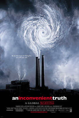
Now, I am not an expert, so maybe one of them art-world bigwigs could explain to me why the poster for Guggenheim(!)-Gore movie, An Inconvenient Truth, looks like a Van Gogh:


Is the message supposed to be that by lowering environmental standards we're cutting off our ear to spite our face?

Wednesday, April 26, 2006

What's the Difference between "Ceramics" and "Pottery" Anyway?

The Met's got a new show up of Betty Woodman, and according to the NY Times, you can't call her stuff "ceramics." (But you can call her a "potter"-- huh??) Um, okay. But I do call "bullshit"! I'm not one to second guess the Met-- that's a real museum, not one of them namby-pamby galleries-- but I just don't get it.

For example, here's a work called The Ming Sisters (2003), which the Times says is "painted all over with bright motifs from old Chinese vases, as well as more abstract markings ":


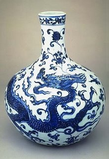
Okay, now here's an actual Ming vase:


Now, I'm not an expert, but I don't really see the similarities, do you?

According to the Times, "Ms. Woodman's work, with its brio and rough textures, has a dashed-off look, even though it is anything but. 'I'm not an artist who wants the viewer to wonder, "How did they ever do that?"' she said. 'It may be a huge amount of work to do, but I don't want it to look like a lot of work.'"

No problem, Betty, no problem.

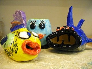
Personally, I think these CERAMICS that I made in 2nd grade are better than Betty Woodman's:

Sunday, April 23, 2006

Billy Sullivan Has Attractive Friends

I wish my friends looked like this:


Instead, my friends look like this:


Thursday, April 20, 2006

Foster? I Hardly Know Her!

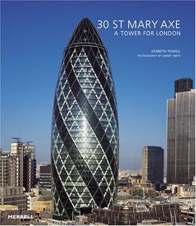
So a reader just sent me over to the latest edition of Artkrush, one of them "online art magazines," where there's a review of a new book about the Foster and Partners building for Swiss Re:

Uh, okay, now that looks a bit like the bullet that's still in my leg from Nam. Or, no, wait, it looks like what Mrs. Outsider Art Critic uses when I roll over to go to sleep.

Yep, it seems to have that effect on her, too.

Monday, April 17, 2006

Pierson v. Doonan

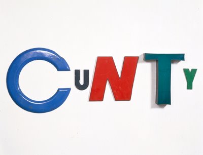
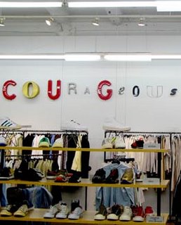
Well, the fur is flying in Chelsea!! Simon Doonan's got a funny article in the NY Observer about this whole hubbub with Jack Pierson. I can't be bothered to explain what those two are up to, so go Google their names together. Basically, Doonan-- the window dresser, etc. of Barneys-- has been dressing the walls of the Barneys stores with words made out of old metal letters salvaged from store signs and the like. This is much like what artist Jack Pierson has been doing as artworks for years. A Pierson work is above; a Doonan example is below:


Now, I'm not an expert, but even I can tell Doonan's stuff ain't Piersons. I wandered into a Barneys a few months ago looking for a toilet, and saw the words all over the walls. I did indeed think it was an "homage"-- I figured it was one gay man tipping his hat to another. Turns out Pierson and his gallerist John Cheim didn't see it that way: They call it a "rip-off." But now Doonan says he's been doing this for years, and he didn't even know of Pierson's word pieces.

I totally believe Doonan-- I mean, this kinda thing has been around forever. But can the gallery really send him a "cease and desist" e-mail, even if he were copying? Does that mean I have to take down the Guernica mural I painted at my auto-body shop? Fuck.

I like Pierson's work-- it's the kinda shit an Outsider like me can understand. But if lots of people are really coming up to him and saying they saw his stuff at Barneys, it's time for him to meet some new people.

Is There a Doctor in the Met?

So, today's NYTimes has an article about medical school students who are required to take an art-history class. The idea behind this, as explained by a Yale medical professor, is that "With heightened observational skills . . . physicians can often ask the questions necessary to make correct diagnoses without relying too much on costly blood tests and X-rays."

GREAT. Just what we need. Doctors who've looked at a portrait of Dora Maar and now can tell something's wrong with a patient who has two eyes on one side of her face. Jesus.

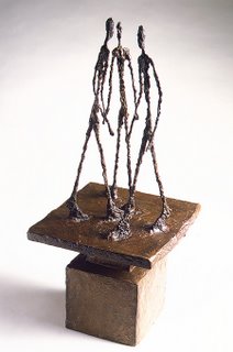
The article follows the students on a short tour of the Metropolitan Museum of Art. What did they look at? Well, one piece was Giacometti's Three Men Walking II (1949).

"This is very interesting," said Max Berenbaum, "because anorexia is rare in men, but the rise of men's fashion magazines and the emphasis on looks in gay male culture has led to a spike in cases of anorexia nervosa among males."

There was much discussion of Gerhard ter Borch's Young Woman at Her Toilet with a Maid (ca. 1650-51).

"Is the weak chin a result of severe inbreeding?" asked Priya Pradhnarapoor. "Or a form of Mongoloidism?"

About Bouguereau's The Proposal, however, the diagnosis was unanimous:

"The moustache has got to go."

Not discussed in the Times but shown in the background of an accompanying photograph--

-- is Balthus's Thérèse Rêvant (1938).

This painting was examined solely by those students specializing in OB-GYN.

Sunday, April 16, 2006

SITE: The Hippie Biennial

Sante Fe keeps its hippie spirit even when holding an international art show. If SITE Santa Fe’s Sixth International Biennial is going for "visceral presence," they certainly got it:

Whoa. Mission accomplished! But the SITE site also claims, "Although one of the intentions of this Biennial is to put the visitor 'in the realm of the senses,' the senses aren’t meant to be overwhelmed." Uh, TOO LATE.

The Outsider Art Critic had the following conversation with a friend, the Grumpy Old Man:

OAC: Oh, man, Cathy, PLEASE!!
GOM: ohmygod. How huge is she?!? It looks like she's nursing a 12 year old.
OAC: Actually, the kid is 6 days old, he just really takes after his mother. . . .

I think I even prefer that turquoise and silver Navajo shit.

Wednesday, April 12, 2006

Some Stuff in Chelsea

Okay, first thing I saw was Phil Collins-- supposedly not that Phil Collins-- at Tanya Bonakdar Gallery. He made a video of "disaffected" Turkish youths singing karaoke versions of Smiths songs.

Now, I can barely listen to the Smiths sing Smiths songs for more than 5 seconds without screaming, so I'm not really sure why anyone would think getting some young Turks to sing them would be any better. And they didn't look all that disaffected to me! They seemed pretty well put together, well dressed, if maybe a bit faggy.

Next up was Tracey Moffatt at Steven Kasher Gallery. She's Australian. Her show has some photographs, and then there was a video with clips of old Hollywood movies, people slapping each other and stuff. Oh, and there were cucumber sandwiches. Don't know if this was actually part of the exhibition or not, but some woman kept walking around with a three-tiered tray with chocolates and sandwiches. I really appreciated that because I hadn't eaten anything all day. I don't quite see how splicing up old movies and handing out snacks is art, but then again, I am not an expert.

Now I'm going to shock you-- believe me, I shocked myself. The Outsider art critic liked the Matthew Barney show at Barbara Gladstone. It could just be that I like cooking with lard, and there looked to be a lot of that all over the gallery. I hope their air conditioner doesn't break. I don't know how they'll describe this stuff in the fancypants publications like Artforum and the like, but here's how I see it:

There was a really nice relationship between pure, defined plastic forms and globby, chunky, messes. And everything's this translucent white color. So you've got hard plastics and fatty mush, and you just want to put your cheek to the cool, clean surfaces and jump in and grab a handful of the thick, buttery ones. At least I did. But this is Art, so you're not allowed to do that.

Okay, now I'm not an expert, but if I were Rachel Whiteread, I'd be looking for a thank-you note in my mailbox right about now.

It's mmm-mmm good!

First Post!

I'm new to this whole blogging thing. It always seemed like something for people with too much time on their hands, spoiled kids wasting their old man's money. But I've been walking around looking at a lot of art recently, and then I try reading about it, and goddamn it if I don't understand what these "experts" are talking about. I don't understand why I'm supposed to like something because of its "tactility" or "painterliness" or whatever other big words they use that I don't understand. So I'm here to give my two cents as the Outsider art critic.